
Description
People’s quality of life or socioeconomic status can greatly differ based on where they live, whether they live in different cities, different counties, or in different countries. These inequalities and disparities can be and have been measured using indicators related to the different facets of life: wealth, education, health, and even happiness. Communicating where and how those inequalities affect different people and geographical areas to the public in an effective and engaging way is imperative to progress towards a more equitable society. Information visualization, and specifically maps, are a successful mechanism for conveying these differences in quality of life and engaging people in caring about larger issues and other people.
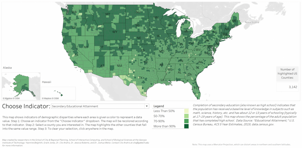
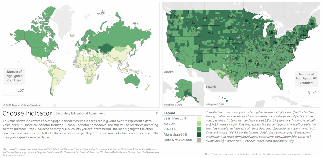
This project investigates how people perceive socioeconomic disparities using an interactive choropleth map visualization where users can change the map to display different socio-demographic indicators, including income inequality, life expectancy, educational attainment, rate of incarceration, and prevalence of HIV/AIDS and obesity. We implemented two versions of the interface: one displaying the United States only by county, and another arranging the United States map and a country-level choropleth map of the world by country, side-by-side. We conducted between-subjects A/B user testing where we surveyed and interviewed users before and after interacting with one version of the map.
We hypothesize that interacting with either map will lead to stronger feelings about the intensity of inequality in the U.S., and more confidence in their opinions on disparities. Additionally, we hypothesize that interacting with a contextualized map of the U.S. within the world will influence the user’s perceptions of the U.S. differently than when interacting with the U.S. map only.
Project Team
- Dr. Clio Andris, Georgia Tech
- Grant Jones, Georgia Tech
- Yasmine Belghith, Georgia Tech
- Kurt Heischmidt, Georgia Tech
- Dr. Joshua S. Weitz, Georgia Tech
- Dr. Jessica Roberts, Georgia Tech